The Ultimate Guide to Designing Print-Ready Word Searches
Professional tips for creating clear, attractive word searches that look great on paper and engage students.
Creating word searches is easy—creating PERFECT printable word searches that look professional and are easy to solve requires attention to detail. After years of creating thousands of classroom printables, I've learned what works and what doesn't. Here are five essential tips for creating word searches that print beautifully every time.
Tip 1: Master Grid Size and Letter Spacing
**The Problem:** Grids that look perfect on screen become cramped or overly large when printed, making them difficult to use.
**The Solution:** Optimal grid sizing depends on age group and paper size.
### Recommended Grid Sizes
**For 8.5" x 11" (Letter) Paper:**
**Elementary (K-2):** - Grid size: 8x8 to 10x10 - Letter size: 24-28pt - Words: 6-8 total - Spacing: 0.75-1 inch per cell
**Elementary (3-5):** - Grid size: 12x12 to 14x14 - Letter size: 18-22pt - Words: 10-12 total - Spacing: 0.5-0.65 inch per cell
**Middle School (6-8):** - Grid size: 15x15 to 18x18 - Letter size: 14-16pt - Words: 12-15 total - Spacing: 0.4-0.5 inch per cell
**High School/Adult:** - Grid size: 18x18 to 22x22 - Letter size: 12-14pt - Words: 15-20 total - Spacing: 0.35-0.45 inch per cell
**Pro Tip:** Always print a test copy before making multiple copies. What looks good on screen doesn't always translate well to paper.
### Letter Spacing Guidelines
**Cell Padding:** Leave at least 2-3mm padding inside each cell so letters don't touch cell borders.
**Grid Line Width:** Use 1pt lines for young learners (easier to see), 0.5pt lines for older students (less visual clutter).
**Border Weight:** Make the outer puzzle border slightly thicker (1.5-2pt) than interior grid lines to clearly define the puzzle area.
Tip 2: Choose the Right Fonts
**The Problem:** Not all fonts are created equal for word searches. Some are difficult to read, confusing (I vs. l), or look unprofessional.
**The Solution:** Use fonts that are clear, well-spaced, and printable.
### Best Fonts for Word Searches
**Top Tier (Highly Recommended):**
1. **Arial** - Classic, clean, easy to read 2. **Helvetica** - Professional, excellent clarity 3. **Verdana** - Designed for screen legibility, prints beautifully 4. **Tahoma** - Similar to Verdana, slightly more compact 5. **Calibri** - Modern, clean, professional default
**Second Tier (Good Options):**
6. **Georgia** - Serif option with good readability 7. **Century Gothic** - Rounded, friendly appearance 8. **Comic Sans MS** - Controversial but actually excellent for young readers and dyslexic students 9. **Open Sans** - Modern, open-source, very readable 10. **Roboto** - Clean, contemporary, excellent spacing
**Fonts to AVOID:**
- **Times New Roman** - Serif font with I/l confusion - **Brush Script** - Too decorative, difficult to read in grid - **Papyrus** - Uneven letter spacing, unprofessional - **Impact** - Too heavy, letters blend together - **Any overly decorative fonts** - Save these for titles only
### Font Selection Guidelines
**For Young Readers (K-2):** - Use sans-serif fonts - Consider Comic Sans, Verdana, or Arial Rounded - Larger point sizes (22-28pt) - Bold weight for extra clarity
**For Students with Dyslexia:** - OpenDyslexic (free specialized font) - Comic Sans (surprisingly effective) - Verdana - Arial
**For Professional/Adult Puzzles:** - Arial - Helvetica - Calibri - Avoid anything too casual
**Letter Confusion Prevention:** Some font pairings create confusion: - I (capital i) vs. l (lowercase L) vs. 1 (number one) - O (letter) vs. 0 (zero) - S vs. 5 - Z vs. 2
Test your font choice by typing "Il1 O0 S5 Z2" and ensuring each character is distinct.
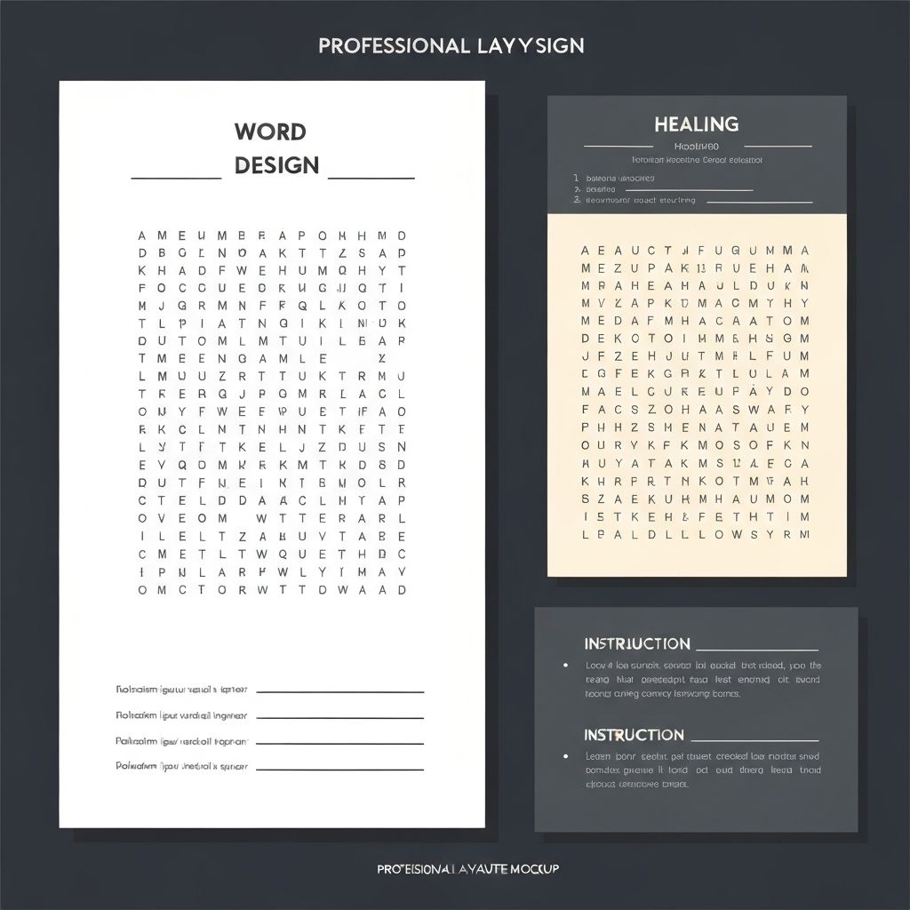
Tip 3: Perfect Your Layout and White Space
**The Problem:** Cramming too much onto one page makes puzzles feel overwhelming and difficult to use.
**The Solution:** Thoughtful layout with appropriate white space improves usability and visual appeal.
### Essential Layout Elements
**1. Title Section (Top):** - Puzzle title: 24-36pt, bold - Subtitle or theme (optional): 14-18pt - Decorative line or border (optional) - Space: 1-1.5 inches from top
**2. Instructions (Below Title):** - Clear, concise directions - Font: 10-12pt - Example: "Find all 12 words hidden in the puzzle. Words may be horizontal, vertical, or diagonal."
**3. Puzzle Grid (Center):** - Centered on page - Leave 0.5-0.75 inch margins on all sides - Grid should be largest element on page
**4. Word Bank (Side or Bottom):**
**Side Placement:** - Best for landscape orientation - 2-3 column format - 10-14pt font - Checkboxes for tracking
**Bottom Placement:** - Best for portrait orientation - 3-4 column format - Fits below grid without crowding
**5. Footer (Optional):** - Small text (8-10pt) - Copyright/attribution - Page number (if multi-page) - Website or creator name
### White Space Management
**Why It Matters:** White space isn't wasted space—it provides visual breathing room, improves focus, and creates professional appearance.
**Golden Rule:** At least 25-30% of page should be white space (areas without text or graphics).
**Strategic White Space:** - 0.5-1 inch margins on all sides - Space between title and instructions (0.25-0.5 inch) - Space between instructions and grid (0.25-0.5 inch) - Space between grid and word bank (0.25-0.5 inch) - Space around optional graphics or decorations
**Common Layout Mistakes:** - Extending grid or text to page edges - Insufficient space between elements - Cluttered word bank with poor organization - Too many decorative elements
Tip 4: Master Print Settings and Paper Choice
**The Problem:** Perfect digital files print poorly due to wrong settings or paper choice.
**The Solution:** Understand optimal print settings for classroom use.
### Printer Settings
**Quality Settings:** - **Draft mode:** Avoid for student copies (too light, poor quality) - **Normal/Standard:** Perfect for classroom use - **Best/High Quality:** Unnecessary for word searches (wastes ink/toner)
**Black & White vs. Color:** - **B&W:** Sufficient for most word searches - **Grayscale:** Good for puzzles with shaded areas or graphics - **Color:** Reserve for special occasions (high ink cost)
**Scaling:** - **Actual size (100%):** Always preferred - **Fit to page:** Use carefully—may shrink puzzle unintentionally - **Shrink oversized:** Safety setting if file is too large
**Double-Sided Printing:** - Place answer key on back (convenient, paper-saving) - Ensure sufficient margins so bleed-through doesn't occur - Use heavier paper (24lb) for double-sided printing
### Paper Selection
**Weight:** - **20lb (Standard):** Fine for single-sided, light use - **24lb (Heavyweight):** Better for double-sided, frequent handling - **32lb (Cardstock):** Excellent for manipulatives, reusable puzzles
**Brightness:** - **92 Bright:** Standard office paper - **96+ Bright:** Premium paper with higher contrast (easier reading)
**Color:** - **White:** Most common, highest contrast - **Cream/Ivory:** Reduces glare, easier on eyes for extended use - **Colored:** Can reduce photocopier strain, helps with organization (blue for Monday, yellow for Tuesday)
**Special Options:** - **Parchment:** Gives aged/antique look for historical themes - **Grid paper:** Pre-printed grids for student-created puzzles - **Perforated:** Easy tear-off for individual distribution
### Cost-Effective Printing Tips
**Save Money on Ink/Toner:** 1. Use grayscale instead of color when possible 2. Reduce graphics to minimum necessary 3. Use outline fonts rather than filled 4. Print multiple puzzles per session (printer warm-up uses most ink) 5. Adjust printer settings to "eco mode" or "toner save"
**Bulk Printing:** - Print class sets at beginning of month - Store in labeled file folders by week/unit - Reduces daily prep time - Takes advantage of bulk printing efficiency
Tip 5: Test, Refine, and Create Templates
**The Problem:** What seems perfect becomes problematic when actually used by students.
**The Solution:** Test every puzzle before mass printing and create reusable templates.
### Testing Protocol
**Step 1: Screen Review** - Check all words are present in grid - Verify word list matches grid - Ensure no spelling errors - Confirm appropriate difficulty level - Review overall visual appeal
**Step 2: Print Test Copy** - Print one copy at actual size - Check if grid is appropriately sized - Verify letters are clearly readable - Ensure adequate spacing - Review overall print quality
**Step 3: Solve the Puzzle** - Complete the puzzle yourself - Note any confusing elements - Check if difficulty matches intent - Time yourself (gauge appropriateness for age) - Mark any problems or improvements
**Step 4: Student Testing (Ideal)** - Give test copy to 2-3 students - Observe them working - Ask for feedback - Note completion time - Identify any struggles
**Step 5: Refinement** Based on testing: - Adjust grid size if needed - Modify font size or type - Clarify instructions - Add or remove words - Adjust difficulty level
### Creating Templates
Save time by creating reusable templates with perfect spacing, fonts, and layouts.
**Template Elements:**
**Master Template (Blank):** - Pre-sized grid area - Title placeholder - Formatted word bank area - Instructions section - All margins and spacing preset
**Themed Templates:** Create specific templates for recurring needs: - Science vocabulary template - Seasonal/holiday template - Weekly spelling template - Historical figures template
**File Organization:** - Main template folder - Subfolders by subject or theme - Clear naming convention - Include both editable and PDF versions
**Template Variations:** - Elementary version (8x8 grid, large font) - Middle school version (12x12 grid, medium font) - High school version (15x15 grid, smaller font) - Blank template for student creation
Bonus Tips: Special Considerations
### For Lamination
If laminating puzzles for reuse: - Use heavier paper (24-32lb) - Leave extra margin space (lamination adds border) - Consider size (laminated sheets are stiffer) - Test dry-erase marker compatibility before mass-producing
### For Photocopying
Original printouts may look different from photocopies: - Print slightly darker than ideal (photocopies lighten) - Avoid very fine lines (may disappear in copying) - Test one photocopy before running class set - Adjust original if photocopy quality is poor
### For Digital Use
If puzzles will be used on tablets/computers: - Save as PDF (preserves formatting) - Ensure interactive elements work - Test on multiple devices - Consider accessibility (screen reader compatibility)
### For Special Needs
Accommodations for various learning needs: - Larger grids with fewer words - High-contrast options (black on yellow) - Dyslexia-friendly fonts - Tactile elements for visually impaired - Simplified layouts with minimal distractions
Common Mistakes and Solutions
**Mistake 1: Grid Too Small** **Solution:** Print test copy and try solving. If you squint or struggle, it's too small.
**Mistake 2: Too Many Words** **Solution:** Reduce word count by 20-30% or increase grid size proportionally.
**Mistake 3: Poor Contrast** **Solution:** Use black text on white paper. Avoid colored backgrounds or patterned paper.
**Mistake 4: Unclear Instructions** **Solution:** Have colleague read instructions without explanation. Can they understand?
**Mistake 5: Inconsistent Formatting** **Solution:** Create and use templates to ensure consistency across all puzzles.
Professional Presentation Checklist
Before printing your word search, verify:
- [ ] Grid is centered on page - [ ] Appropriate margins on all sides - [ ] Clear, readable font - [ ] No spelling errors in grid or word bank - [ ] Instructions are concise and clear - [ ] Word bank is organized and easy to read - [ ] Title is prominent and descriptive - [ ] Adequate white space throughout - [ ] Print test copy looks professional - [ ] Difficulty matches intended audience - [ ] All words are findable - [ ] Answer key is available
Conclusion: Details Make the Difference
Perfect printable word searches result from attention to seemingly small details: appropriate grid sizing, readable fonts, thoughtful layout, optimal print settings, and thorough testing. These elements combine to create professional, user-friendly puzzles that students enjoy and teachers trust.
Invest time creating templates with ideal specifications for your classroom needs. Once perfected, you can generate high-quality word searches quickly and consistently. Your students will appreciate the clear, professional puzzles, and you'll appreciate the streamlined workflow that saves time while maintaining quality.
Start with one perfect template this week. Test it thoroughly. Refine as needed. Soon you'll have a library of templates ready for any occasion, ensuring every word search you print is professional, effective, and perfectly printable.